
PNE RE-BRAND
2023 | PNE | Vancouver, BC
Brief
-
I worked within the PNE marketing team to launch the PNE’s first major brand refresh in over 113 years. Over the years, the PNE has evolved from a summer fair into a year-round entertainment destination with multiple event venues and a diverse collection of events.
-
The primary challenge was shifting public perception of what the PNE truly represents. Many people associate the PNE exclusively with the annual summer fair, with limited awareness of its role as a year-round, nonprofit organization that operates major attractions and venues such as Playland and the Pacific Coliseum. While the brand has strong recognition among older generations, it has historically had less resonance with Millennials, Gen Z, and newer residents of British Columbia, resulting in weaker brand affinity and engagement among these audiences.
-
The solution was a comprehensive rebrand of the PNE, built around a unifying idea: PLAY. This concept reflected the common thread across all PNE experiences bringing people together to have fun, celebrate community, and create shared moments. The new brand identity was designed to capture the energy, diversity, and cultural impact of the PNE, translating these values into a bold, contemporary visual and verbal system.
To strengthen brand recognition and cohesion, we connected all year-round marquee events under a single, clearly defined parent brand, ensuring audiences understood that experiences across Playland, the Pacific Coliseum, and seasonal events were all part of the PNE ecosystem. To better engage younger audiences, we led digital-first campaigns, introduced a youthful brand spokesperson, and partnered with relevant content creators. These efforts were supported by a refreshed, dynamic, and vibrant brand identity that repositioned the PNE as a modern, inclusive, and year-round destination.
-
Through a comprehensive brand refresh spanning visual identity, verbal positioning, digital presence, and strategic architecture, I helped to reintroduce the PNE as a more vibrant, connected, and audience-focused brand.
As a direct result of our efforts, brand recognition among the 18–34 age group increased by 20%, while overall website traffic rose by 67% within the first three months post-launch. Social media engagement across key platforms grew by 54%, and email open rates improved by 35% following the rollout of the new voice and visuals. By aligning all brand elements under a unified identity centered around play, we created a clearer, more engaging story that positions the PNE for long-term growth.
20% increase
In brand recognition for the 18-34 age group
67% Increase
In website traffic
54% Increase
In social media engagement
35% Increase
In email open rates
journey
1
research & INSIGHTS
After extensive research, including a variety of discovery formats such as small group workshops, surveys, one-on-one interviews and market research, we formed the strategic positioning for our brand.
In January 2023, a public perception survey was conducted to better understand how the PNE brand was viewed. The results revealed that 98% of respondents primarily associated the PNE with only “The Fair”, with limited awareness of its broader role as a year-round, nonprofit organization. Many were unaware that the PNE owns and operates major venues such as Playland and the Pacific Coliseum.
Brand familiarity skewed heavily toward older audiences, peaking among the 65–74 age group. Awareness was lowest among those aged 18–24, highlighting a significant opportunity to reposition the brand for younger audiences.
These findings underscored a core perception challenge: while the PNE was well known as an annual summer event, it lacked recognition as a modern, year-round, multi-faceted entertainment organization. Relevance was weaker among Millennials, Gen Z, and newer residents of British Columbia, signaling a need to refresh the brand and strengthen cohesion across its events, attractions, and venues.
Additional research identified the drivers behind this lack of brand affinity. The visual identity leaned heavily on dated photography and older demographic representation, while the logo and overall look felt rooted in nostalgia. As a result, the PNE was more closely connected to childhood memories and Vancouver’s past than positioned as a contemporary, dynamic destination. This created a clear opportunity to modernize the brand and build stronger emotional connections with future audiences.
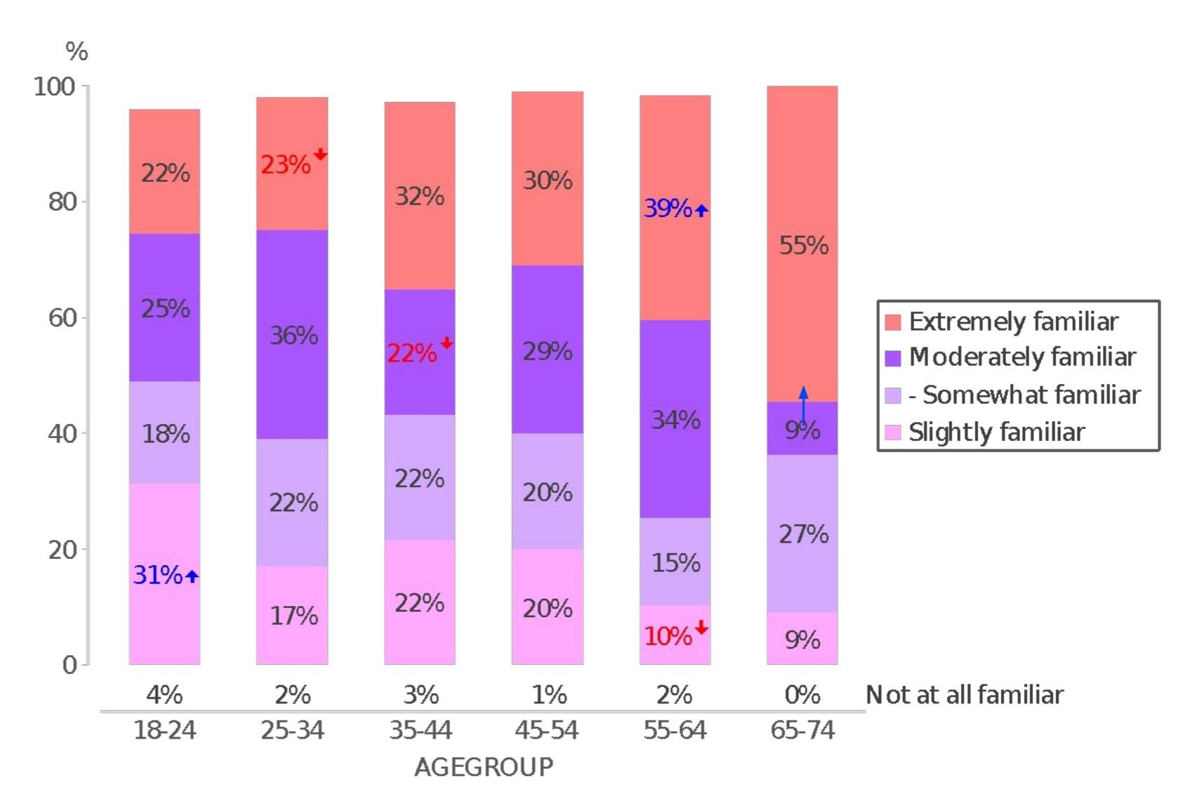
Vancouver’s familiarity with the pne
2
NEW VISUAL IDENTITY
I collaborated closely with the internal PNE brand team and the Cossette brand consultancy to modernize the PNE’s visual identity and reposition the brand for a more contemporary audience.
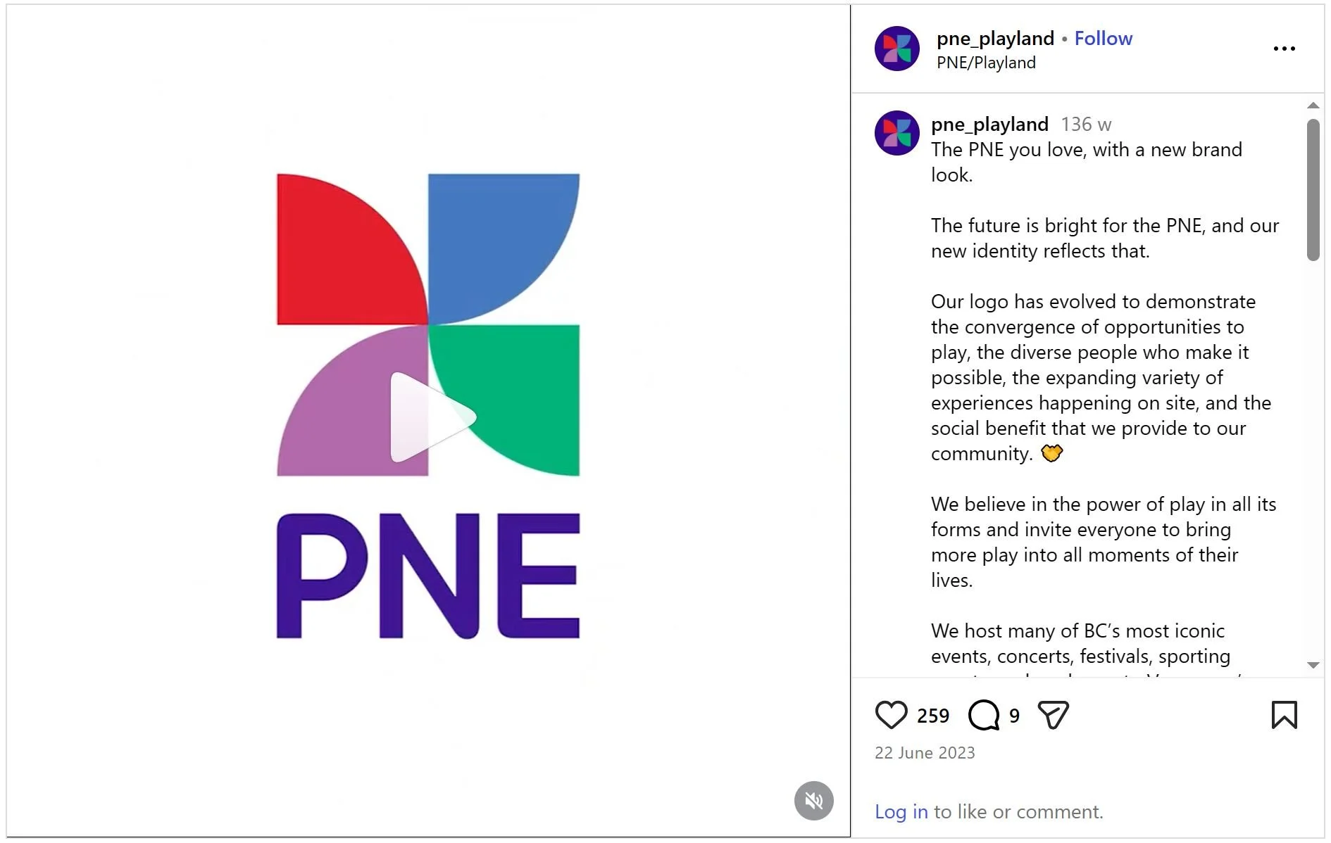
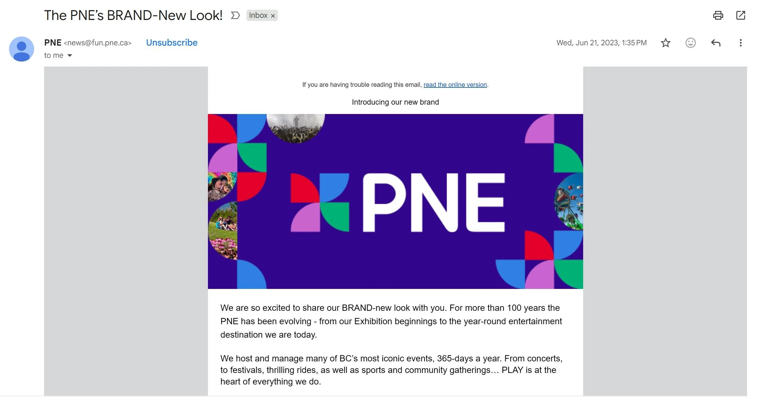
The logo was redesigned to be bolder, more eye-catching, and distinctly modern, reflecting the PNE’s evolved personality while maintaining brand recognition. A refreshed colour palette was developed to convey a more youthful, energetic, and inclusive tone, with careful attention to colour harmony and consistency across all marketing channels and platforms.
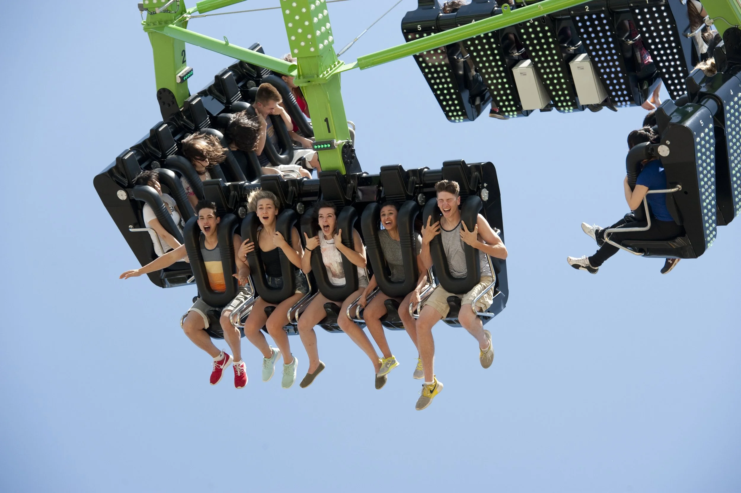
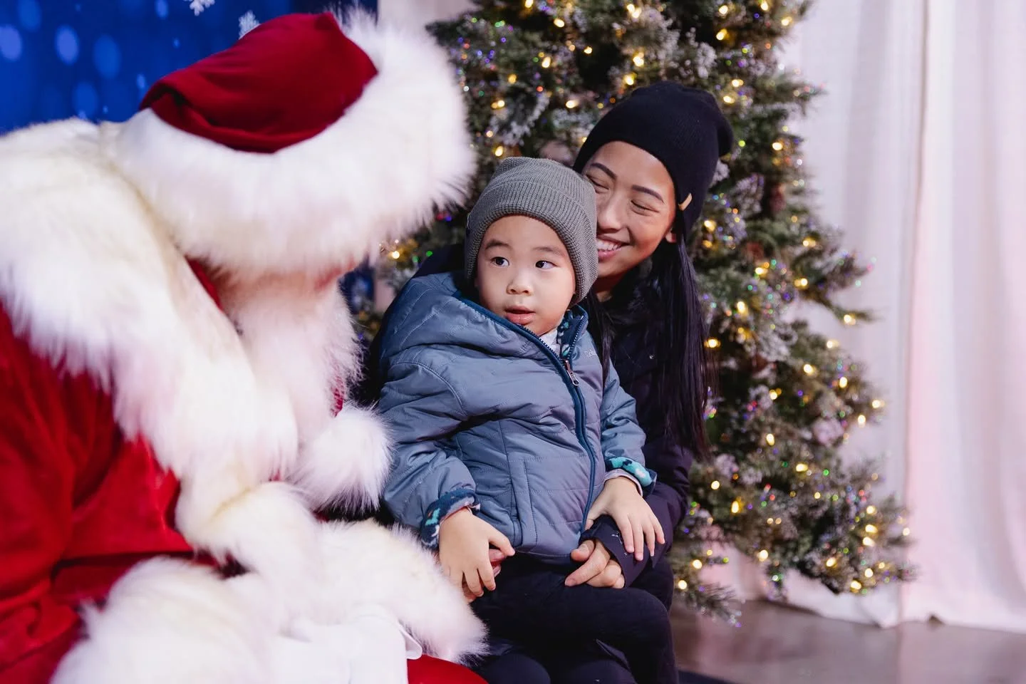
Updated typography was selected to improve readability while reinforcing the brand’s playful, dynamic character. To support the new identity, I led creative direction for photography, guiding the team toward a brighter, more saturated visual style that emphasized diversity, a wider age range, and authentic, emotionally driven moments. I also oversaw the development of updated visual specifications to ensure alignment across the redesigned website and broader digital ecosystem.


NEW Photography


3
NEW VerbAL IDENTITY
As part of the brand evolution, I refined the PNE’s tone of voice across all channels, with a particular focus on social media. We shifted away from corporate, institutional language and toward a more energetic, bold, and playful voice that better reflected the spirit of the organization. By introducing copy with personality and warmth, we created a more approachable brand presence and strengthened audience engagement.
I also helped develop and implement the PNE’s refreshed brand positioning and core messaging framework. This included clearly articulating the organization’s purpose and value propositions across all communication channels and introducing the unifying brand message: “Bringing Play to Everyday.”
As part of this repositioning, the organization formally embraced the name “PNE,” retiring the longer “Pacific National Exhibition.” The change reflected both audience behavior and strategic intent: while proudly rooted on the Pacific, the organization is neither a national fair nor solely an exhibition. The simplified name reinforced brand clarity, modern relevance, and alignment with how audiences already referred to it.
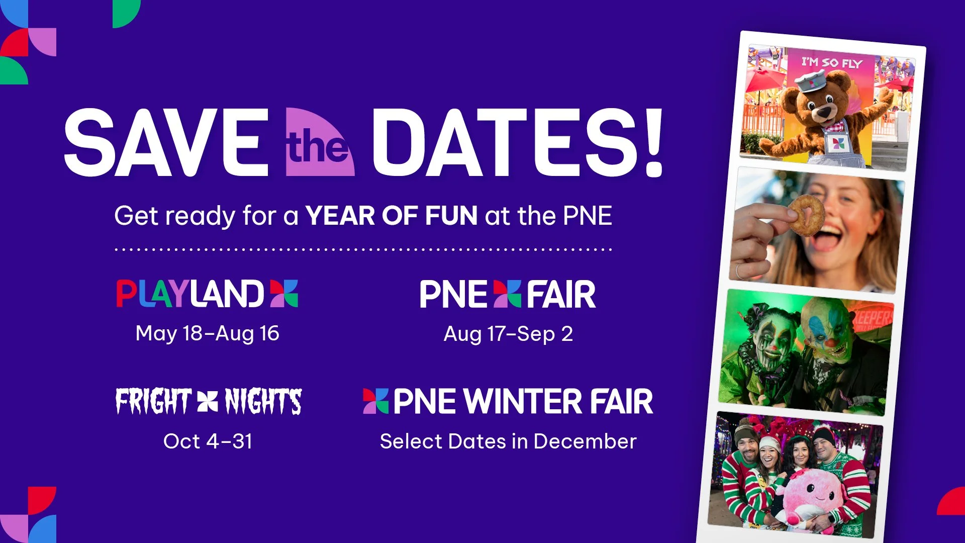
To strengthen brand equity and modernize perception, I repositioned PNE as a strong parent brand anchoring its diverse portfolio of experiences. Previously viewed primarily as “the fair,” the organization lacked cohesion across its four marquee annual events and year-round offerings.
I developed a unified brand architecture that connected all sub-brands under one cohesive PNE identity while preserving the distinct personalities of each event. For example, Fright Nights maintains its dark, edgy tone for teens and young adults, while the PNE Fair retains its family-forward appeal. The system ensures creative flexibility within a consistent visual and verbal framework.
To reinforce this structure, we launched a social-first annual reveal campaign that introduced all major events at the start of the year, positioning them as chapters within one connected PNE story. A refreshed identity system carried across digital, OOH, print, and radio, supported by influencer partnerships to extend reach among younger audiences.
The result: greater brand clarity, stronger cross-event recognition, and a more cohesive narrative that positions PNE as a year-round entertainment brand rather than a single seasonal event.
UNIFIED BRAND Architecture
4
applied new brand on digital platforms
5
OBJECTIVE
Ensure the refreshed brand identity translated seamlessly across all digital touchpoints, creating a cohesive, modern experience that resonated with younger audiences.
WEBSITE ROLLOUT
We redesigned the website to fully reflect the new visual and verbal identity, integrating the updated logo, colour palette, typography, and visual system throughout. Content was refined to align with the refreshed tone of voice, using purposeful imagery and more dynamic, emotionally driven language.
To formally introduce the evolution, we developed a dedicated rebrand landing page that articulated the new positioning and unified message.
SOCIAL MEDIA ROLLOUT
We overhauled social templates, profile assets, and content frameworks across Instagram and TikTok to ensure visual consistency and stronger brand recall. The new identity was rolled out holistically, reinforcing recognition through consistent use of colour, typography, and tone.
To deepen connection with younger audiences, we introduced a youthful brand spokesperson to serve as a recognizable face across channels, creating continuity and personality. We also partnered with contemporary content creators to expand reach and embed the brand more authentically within Gen Z and Millennial digital culture.
EMAIL MARKETING ROLLOUT
We relaunched email communications under the new brand system, redesigning templates to reflect the updated visual identity and voice. Emails were intentionally shortened to match evolving attention spans, particularly among Gen Z audiences.
Copywriting shifted toward more playful, energetic subject lines and concise, high-impact messaging. Dynamic content elements were incorporated to increase engagement and create a more interactive brand experience.
IMPACT
The result was a digitally cohesive brand presence that felt modern, culturally relevant, and aligned across all platforms—strengthening recognition, engagement, and long-term brand equity.